Public sector pay is in the news and it has been the subject of some of the most heated exchanges between Theresa May and Jeremey Corbyn since the election.
But what exactly are the numbers behind the pay cap? Here we take a look at what the data tells us about the cap on public sector pay and the rising cost of living.
For seven years now, public sector workers – people who work in the NHS, for councils, schools, colleges, universities, the police, and more – have not had a pay rise. In each of those years, they either got no increase at all or saw their pay rise by just 1%.
The problem is, while it may seem that the 1% pay increase was a pay rise, it wasn’t. And the reason is inflation. Inflation – when the cost of goods go up – means that, effectively, public sector workers’ pay is worth less. And prices have been rising by a lot.
We all know that the price of things go up, but when you look at how much they have gone up, and compare that with people’s pay, the difference is shocking.
Between 2010 and 2016 the cost of rent went up by 17%; the cost of electricity went up by 28%; the cost of sending a child to nursery school went up by 21% and the cost of holidays in the UK went up by 27%. Suddenly, you can’t get as much for your money.
In the chart below you can see how much the cost of everything has increased, compared to how much public sector pay has increased.
(This data was taken from the RPI indices from Office of National Statistics Consumer Prices Inflation data, except house price data which is taken from ONS House Price Index and childcare costs which is from the Family & Childcare Trust Surveys, with the costs based on 25 hours of care).
So, what does this mean for public sector workers? It means that they’ve lost money.
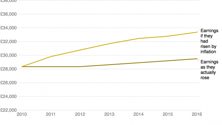
In 2010 the average – median – wage of a public sector worker was £28,339.
In the table below you can see what the average public sector worker has been earning over the last seven years, compared to what they would be earning if their pay had increased at the same rate as inflation.
We can see from the table above that in 2011, this average worker would have been £1,474 worse off. Even though their salary was exactly the same as the year before, everything they needed cost more. Which could be the cost of, say, a family holiday.
In 2016, they would have lost £3,875. The cost of a nice car perhaps. Or food for a large family for a year.
But if you count their losses from 2010 to 2016, they are £17,962 worse off. Which is the cost of a deposit on a house in some areas of the country, or a car and some money towards a child’s university education.
And what about people in specific roles? The two tables below show how much different public sector workers would have earned in 2016 if they had received pay increases that matched the rise in inflation, compared to what they actually received.
And some more jobs…
As you can see, public sector workers’ pay has been falling in value year on year, which means each year money is getting tighter and tighter for the people who run our public services. That’s why UNISON is campaigning to raise the pay of all public sector workers.
Find out what the pay cap has cost you and read about our Pay up Now! campaign

